— Regulatory Change Management App
Platform: Responsive web - desktop native
— My Role
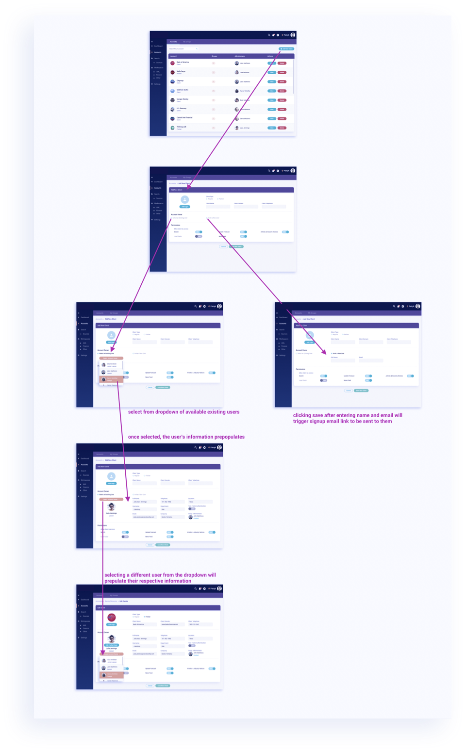
Market and user research, user journeys and roadmaps, user stories, wireframes, creating working prototypes on InVision to present to various stakeholders and client proposals, visual design of entire platform, style guide creation for future features, and creating accessible themes and features. I was able to take on more responsibility on this product and help our product owner with user stories and requirements mapping. I then designed the entire interface from start to finish.
— Vision
Our goal was to build an in-house product to provide a regulatory change management solution to clients. The challenge was building this platform completely from scratch. We started with market research to determine what products were out there and what features were lacking. From here we were able to map out user journeys and write out requirements. The goal was to build a platform that would streamline and automate the change detection process and provide a personalized solution to fit clients’ needs.
— UX Challenges
-The biggest challenge was not having a client/users to do user testing on. Our workaround to not having users or clients to test the features on was to roll out the product to everyone in our company and have them play around with the features to gather important feedback. We gave everyone a link to the demo site along with a list of tasks and followed the users through the journey to see where they experienced pain points and determine what UX fixes needed to be made. One of the big problems we encountered was that users didn’t like that rows within tables were not clickable.
-Another issue we were able to identify from this process was that there were inconsistencies with the styling of certain features. We had too many types of buttons and links and popup modules.
— UX Solutions
-With the feedback we got from our in-house user testing were able to fix the big UX issues and create a more efficient product. We made the table rows clickable to allow for quick streamlined access to important information.
-Using the feedback about the confusing amount of styling differences, I put together a style guide and identified all the areas of overlap, repetition, and clutter. I cleaned up the style guide and limited the number of variations to just a few and was thus able to create a more familiar and efficient interface for users. Our front-end developer was then able to use the style guide to build out new features easily and quickly.
— Impact
We were able to build out the core features of the platform and release a demo build of the app to potential clients. From a design perspective, I designed the entire platform from start to finish, and created a design system/style guide so that any future feature implementations would be seamless. I created accessible and client-specific themes to demo for potential clients.


