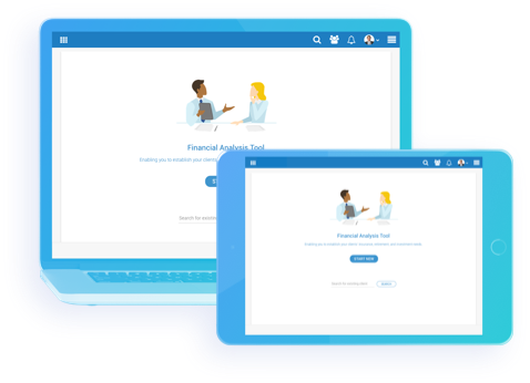
— Financial Goals App
Platform: Responsive web - for tablet and desktop
— My Role
Market and user research, personas, usability testing, user journeys and roadmaps, wireframes, creating working prototypes on InVision to present to various stakeholders and to use for user testing, visual design of entire platform (following an already established design system).
— Vision
Our suite of products needed a web-based platform to conduct a financial needs profile for clients. The platform needed to be B2B to be used internally by brokers and also have a B2C component that brokers could use to directly communicate with and gather information from clients. Working closely with the product manager, we concluded that the goal of the product would be to meet insurance and investment needs of the client, bridge the gap in information literacy, build trust, prioritize investment and insurance needs, recommend the most suitable solution, and provide ongoing advice.
— UX Challenges
-Building a platform from scratch with minimal user/client input in early stages and making the interface for a variety of users including insurance agents, and end clients who would come from a variety of age groups, income groups, and with different levels of technical knowledge.
-User testing within the team determined that users had difficulty understanding what the difference between different types of goals were and why certain information was required in order to calculate their needs. The other difficulty for both insurers and clients was figuring out how to prioritize which goals were more important than others.
— UX Solutions
-With the product manager we came up with 3 personas that we would be designing the app for: the insurance agent, the customer who has basic knowledge about the type and amount of insurance they need to get, and the customer who is clueless about the whole process. I was able to design the interface with these 3 personas in mind and the end result was a platform that was easy to understand for a wide range of users.
-The goal selection page was iterated multiple times until we arrived at a final solution which included an interactive drag and drop component into needs/wants/wishes columns and only displaying the most basic required fields, with clear and straight to the point labels to minimize confusion as much as possible. We were able to cut down on the use of tooltips drastically because the way we laid the information out made much more sense than just presenting customers with a giant form.
— Impact
User testing proved crucial in forming the way that financial goal selection was laid out and the way that the broker communicated with the client. We were able to build a functional product that was easy to use for both insurance agents and clients to use interchangeably. We also began building the client-facing survey portion of the product.


